Labour’s Green Belt gamble

Labour’s new emphasis on housebuilding seems to break a Green Belt taboo that has gripped all the main parties for decades. Has the electoral calculus finally changed? I’ve taken a look at the numbers.

The truth is the housing crisis won’t be solved without allowing cities to expand into some parts of the Green Belt, but politicians have consistently calculated that doing so is a vote loser. But as Jonn Elledge has pointed out, Labour may now be at a point where it’s not such a gamble if the constituencies affected are mostly never going to vote for them anyway. So does the data back this up?

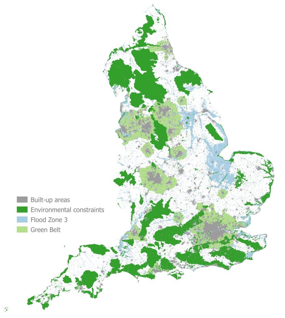
England accounts for 533 of Parliament’s 650 constituencies*. Of these a surprisingly high 316 (59%) have some Green Belt, albeit sometimes only a sliver. And of the constituencies with Green Belt, 194 are held by Conservative MPs (well, they were in 2019 anyway…), that’s 61%.

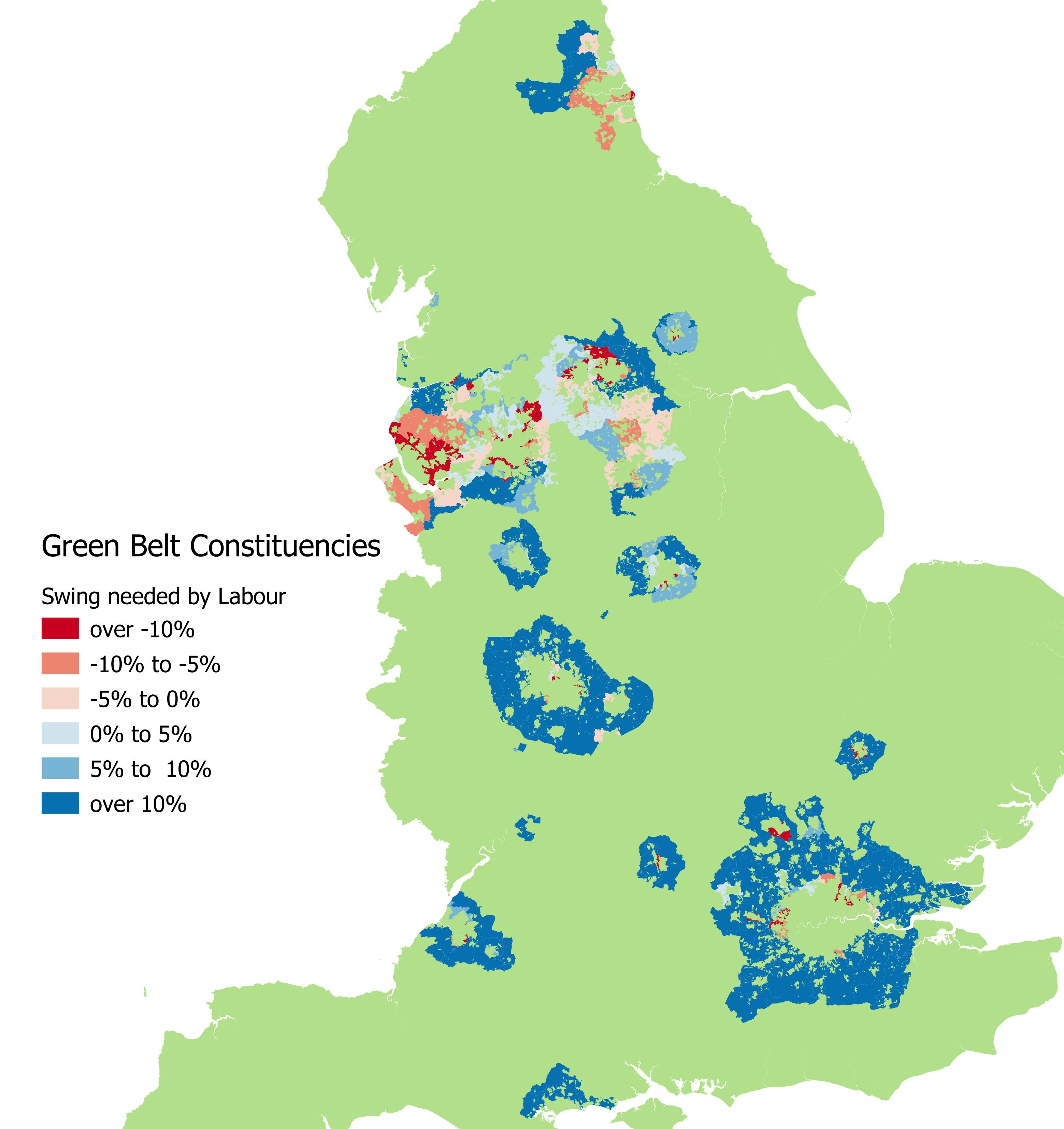
But here’s where it gets interesting for Labour. Of those 194 English Green Belt Tory seats, 140 would need a swing of over 10% for Labour to win. Not impossible, but safe seats that are perhaps mostly not necessary for an overall majority, so are not target seats**.

And on the other side, a further 29 seats would need a swing to Labour of less that 5%, perhaps close enough that Labour could still overcome a nimby backlash – current polls equate to a swing of about 15%.

So there are just 25 seats where there is Green Belt and Labour need a swing of between 5-10% – electoral territory where anti development sentiments might sway things. In two of these, Labour are not the second placed party, so may not be challenging anyway. And one has less than 1% Green Belt, so may not be a significant issue.

That leaves 22 seats (just 3% of the total seats in Parliament) where Green Belt housebuilding might be a local issue for Labour. Interestingly, only five*** are in southern England where housing pressure on the Green Belt has arguably been most politically charged. A further six are in the Midlands, and 11 in the North.

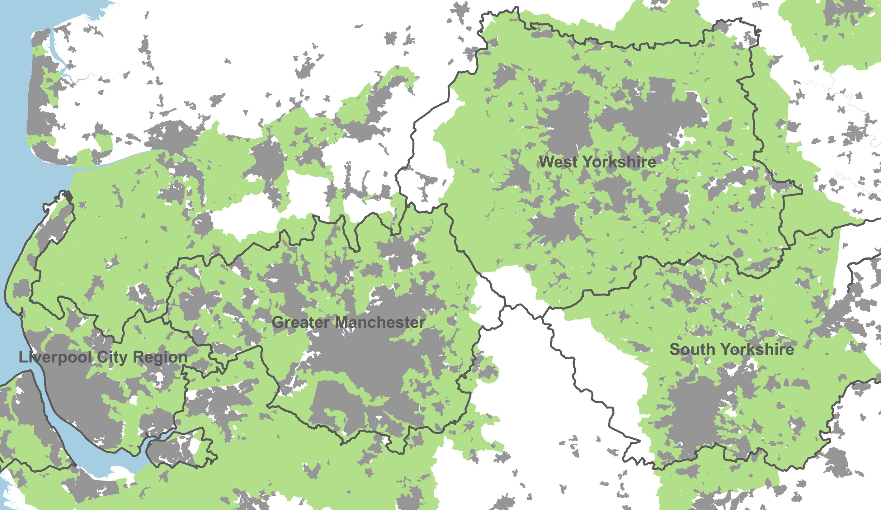
To see what that looks like, the map below shows constituencies in the English greenbelt coloured by the swing needed by Labour take them. Dark blue are safe Tory seats, most of which Labour wouldn’t need to form a majority at the next election.

Perhaps finally we really are at a point where there could be an electoral majority for housebuilding.

* Note I’m using 2019 boundaries, for simplicity, and using the 2019 general election results

** I’m no psephologist, and am simplifying greatly here. Draw the lines differently and the numbers will change.

*** Harrow East, Uxbridge & South Ruislip, Stevenage, Bournemouth East, and Filton & Bradley Stoke

In Praise of Coalescence – When 2 Become 1

The English planning system has always frowned on places merging together. Whether it’s “strategic gaps”, “green corridors” or the Green Belt purpose “to prevent neighbouring towns merging into one another”, coalescence is assumed to be a dirty word. It’s time to challenge this – the economics is clear, we need bigger cities, not more towns.

Identity

The assumption is so deeply embedded in policy as an article of faith that it is rarely spelt out why our urban areas must be kept fragmented in separate towns. At most we may get a passing reference to local identity. But we don’t stop to ask if this is really true, nor to count the costs of strangling the natural growth of cities.

Identity is a subtle thing. I suspect most residents of Wolverhampton or Oldham, for example, retain that local identity despite continuous urban fabric joining them to Birmingham and Manchester respectively. And a 20 metre gully of Green Belt passing under the A647 is not why the people of Bradford remember they’re not in Leeds. Identities can and do survive coalescence into conurbations – just ask Croydon or Epsom.

Agglomeration

It is a well-established consensus in economics that people benefit from being together – bigger and better-connected places tend to be richer than more isolated communities. In many ways the story of economic development is one of urbanisation. And when cities are allowed to grow they naturally swallow neighbours to become conurbations, but we seem to have forgotten that this is a good thing, and it happens because people want to live there.

The world’s great cities are a roll call of successful coalescence. When the cities of London and Westminster merged, the result was pretty effective! Likewise Brooklyn and New York, Buda and Pest. And would Silicon Valley be the powerhouse it is now if planners had preserved the isolation of San Francisco, Palo Alto and San Jose?

Yet in England we try hard to ensure no great city can ever emerge again. The result is that our second-tier cities are often poorer and less productive than their peers in comparable countries. In large part, as Tom Forth has rightly pointed out, this is because we don’t invest in efficient transport – without trams or a metro system a city has a smaller effective size or catchment. But more broadly, it is the result of the planning system’s aversion to coalescence. Through greenbelt and other policies, we have frozen places such as West Yorkshire or Greater Manchester into perpetually half-formed cities, a collection of smaller places caught in the act of conurbation, but never allowed to consummate.

Building for sustainability

Other things being equal (where landscape or ecology allow), rather than preserve the separation of towns, we should actively embrace their merger. We need to build a lot more housing, and the most sustainable place to build is likely to be in that gap that joins two places into a greater whole.

That is a place people want to live, it gives access to both places, twice as many jobs, twice the range of retail and leisure, twice the choice of public services. Filling in that gap benefits the economy too – business in both places get access to a larger customer base, and a larger labour market. And it makes public services cheaper to provide, and easier to hit the critical mass needed to sustain everything from hospitals to bus services.

These gaps will already have access to a much better range of existing infrastructure, including transport links, than more isolated places on the other side of a town. And concentrating development in the corridor between towns strengthens the case for investment in rail, tram or bus connections in a way scattered growth elsewhere never will.

The English planning system was born from a reaction to the pollution and disease of 19th century cities. The response was often to “start again” with planned new towns, while stopping cities from growing. In the 21st century it’s time to recognise this is making us poorer. Our cities are too small. It’s time to plan for the healthy and liveable conurbations of the future. Bring back coalescence.

Twenty’s Plenty – now Time for Ten?

Photo credit: Acabashi

In 30 years we’ve gone from a few local experiments, to 20mph now becoming the standard for residential streets in many places. But is this enough? New car technology means there’s now a growing case for 10mph limits, and they could help fill the gap where Low Traffic Neighbourhoods (LTNs) have been rejected.

I started my career in journalism, where I covered some of those early 20mph experiments. Each had to be signed off by the Secretary of State, and were only allowed where road design made them self-enforcing. As evidence mounted that they worked, rules were relaxed and 20mph zones spread. Now cities such as Manchester will soon by mostly 20mph, while Wales plans to make it the default across the country.

And 20mph works. A study last week by Transport for London found it had cut collisions and serious injuries by 25%. That’s great for inner-urban main roads, but there are plenty of smaller, narrow residential side-streets where sensible drivers would see 20mph as recklessly fast. So why do we still allow it?

Of course in many countries, lower speed limits are already common. In much of Europe 30kmph (18.6mph) limits are standard, while residential streets in parts of Belgium are now 20kmph (12.4mph) and in the Netherlands two million people live on 15kmph (9.3mph) “woonerf” streets.

These lower speeds make a big difference. At 20mph your stopping distance is about two and a half times further than at 10mph, and your kinetic energy (the punch you pack in a crash) is four times higher. The higher your speed, the further ahead you focus, making you less aware of your immediate surroundings. Faster vehicles are not only more likely to hit people, but the consequence of any crash are much more severe. In local residential side-streets with pedestrians, cyclists and children, 10mph could literally be a life saver.

But in the UK we only see 10mph limits on private roads as anything below 20 needs special permission from the government. One reason for the reluctance is compliance. In perhaps our greatest collective act of mass defiance of the law, average traffic speeds on 20mph roads are 30% above the speed limit according to the DfT. What’s the point of lowering limits if we’re all going to ignore them anyway?

Well that all changes now, thanks to mandatory speed limiters fitted to all new cars. Using cameras and GPS to check the speed limit, drivers are first warned, then the car is automatically slowed down. They can be overridden, but over time as the technology spreads through the car parc (the rather confusing term transport planners use for the stock of all cars in the country) we’ll see most traffic automatically complying with speed limits most of the time.

At that point we may be able to do away with speed humps. The public may even come to see speeding enforcement not as “sneaky” or “unfair” picking on ordinary drivers, but instead as justified punishment of the minority who have actively set out to break rules that the rest of us abide by. It also means 10mph speed limits would become self-enforcing and practical.

As well as reducing serious injuries, 10mph limits could bring other benefits. One response to rat-running through unsuitable residential streets has been to block them with traffic filters. But while these LTNs are generally very popular when well-established, it has proved politically difficult to introduce new ones in some places. In the meantime, lower speed limits could help make side streets unattractive to satnavs that are constantly seeking out the fastest route.

It also dramatically reduces conflict between drivers and cyclists. At 20mph, most cyclists are an obstacle to motorists, leading impatient drivers to force their way past dangerously. At 10mph, cyclists and drivers are mostly at a similar pace, and co-exist in a totally different way.

Would people accept 10mph? It’s clearly impractical for through routes, but for side streets designed just for living on, slower speeds would cause very little inconvenience. If the first and last couple of hundred metres of your journey were 10mph rather then 20mph, it would add just 45 seconds to your whole trip. And in return, you could get to live on a safe, quiet, street even without any barriers.

The technology to make speed limits work is finally here, 20 is more than plenty, it’s time we started planning for 10.

Shifting Population – Part II

My previous post looked at how England’s population is shifting. This one compares how homes and jobs have shifted.

The map below shows the centre-of-gravity of homes, people and jobs in England, in 2011 and 2021. All are moving southwards, but not equally.

People go where the jobs are. Many home moves are just a local change in accommodation, but when people move to a completely new area it is very often because of a new job. Relatively stronger growth in London has dragged the centre-of-gravity of employment in England several kilometres southeast. And people have followed.

However, the population is still lagging the jobs. This may be partly because they are held back by lack of housing near jobs, leading to longer commutes overall. The centre of where England’s homes are has barely moved – physical buildings take longer to change than people, particularly when we’re not building enough homes where people want them.

The chart below takes a slightly longer look, over the 20 years since the 2001 Census. Each square represents one kilometre.

In 2001 England’s population and housing was almost exactly in balance, centred just 50 metres apart, east of Clifton-upon-Dunsmore in Rugby. But as employment attracted people south-eastwards, housing has failed to keep up. The result is likely to be more overcrowding in successful areas, as well as a constraint on productivity.


Note on methodology and caveats

Firstly to say again that this owes a great debt to the ideas in James Gleeson’s post of 2016, of which this is simply an update.

As with my first post on population shifts I have weighted centroids of local areas, in this case by population, dwellings or jobs. I have used a mixture of 2011 and 2021 Mid Layer Super Output Areas and 2001 Census Area Statistics Wards, depending on the dataset.

For population I have taken Census usual resident population.

For homes I have used Census accommodation data for occupied homes, so this excludes vacant properties which is an important caveat – lower rates of vacancy in the south east may mean housing has actually shifted even slower than shown here.

Finally for employment I have used workplace based jobs from Census 2001 and 2011, but this is not yet available for Census 2021 so I have instead used the Business Register and Employment Survey data. Some caution is needed in interpreting this as it may not be directly comparable to the Census, however it is the best currently available source.

Shifting Population

Where are we going?

For the last century England’s population has gradually shifted southeast, but what does the latest Census tell us about where the population’s centre-of-gravity is heading?

This post is inspired by James Gleeson’s excellent 2016 post Tracking England’s Shifting Centre-of-Gravity Over Time and my curiosity to update it with the new Census.

His historical analysis showed the centre of England’s population started the 19th Century just east of Coventry, and headed steadily north for over a hundred years, up the M69 in the direction of Leicester. Around the First World Ward, this reversed, with the centre of population taking a turn southeast. At the time of the 2011 Census it was last seen racing past Rugby on the A5 (Watling Street) heading towards London.

So what happened since 2011? We have two sources, the annual Mid Year Estimates (MYEs) produced by the Office for National Statistics, and now the new 2021 Census. The map below is what these show.

So from 2011 to 2021 the centre of population continued to move southeast and has now entered West Northamptonshire, close to the Houlton housing development in Rugby. Appropriately enough, it is right in the middle of DIRFT, the country’s largest railfreight logistics interchange, just off Junction 18 of the M1. Specifically, it’s in the car park of the Sainsbury’s Daventry Distribution Centre. This area is called the logistics Golden Triangle for good reason, within 4 hours drive of 90% of Britain’s population.

The mid-year estimates for the intervening years show a slowing trend, and then an abrupt break with Census 2021 putting it noticeably west and no further south than the 2020 estimates. Of course it is normal for the Census to differ from the estimates (that’s the whole point of doing an actual Census), and in the next few months the ONS will publish rebased mid-year estimates from 2012-2020 to make them consistent.

It will be interesting to see the degree to which the ONS rebasing shows this shift in direction to be a gradual trend over the last ten years, or a sudden shift because of Covid. And if Covid has affected it, how much it is temporary or permanent? The 2021 Census in England took place during partial lockdown, with everyone asked to work remotely if they could. Many people may not have been living at their normal address on Census day.

To the extent this shows a real effect, rather than a Covid Census artifact, what might be the cause? James’s earlier post showed elegantly how population was following jobs, with housing trailing some way behind. At some point this lag – a failure to build homes where jobs are growing fastest – will inevitably constrain people’s ability to follow those jobs.

If so, you’d expect to see the results of that in high house prices, lower productivity growth, and staff shortages.


Methodology Note – I’ve used Mid Layer Super Output Areas (MSOA) – a census geography roughly similar in size to an electoral ward. I’ve taken the geographical centroid of each MSOA, and weighted them by population. For 2011 to 2020 I’ve used the 2011 MSOAs, and for the 2021 Census I’ve used the new 2021 MSOAs. Note this analysis is England-only because GB or UK data not available yet – Scotland took the sensible decision to delay their Census a year, so it wasn’t so badly distorted by Covid.

England’s schools lose 10,000 children during lockdown

There is growing speculation that the UK’s population may have fallen during the pandemic. We won’t have results from the Census until March next year*, but in the meantime new data suggests England’s schools may have lost 10,000 pupils over the course of the last year (potentially because of migration, thankfully not directly because of Covid).

Continue reading

Living with Anosmia

Bisto advertisement

February 27th every year is Anosmia Awareness Day, but Covid means this year is different and anosmia (loss of smell) is suddenly big news. I’ve been completely anosmic all my life – this post is a personal reflection on my own experience, in the hope it may be of interest to those newly experiencing it.

Continue reading

A perfect demographic storm?

Is Britain’s demographic destiny suddenly turning a corner? After decades of rapidly-rising population, all of a sudden births, deaths and migration may all be aligning to point the other way, with profound implications for policy and finance – not least planning and housebuilding. What’s the evidence, and what will it mean?

Continue reading

Map-reading Covid-19

2020 has brought data into the news like never before. From exponential curves to Bayesian probability, making sense of the pandemic has been a crash course in stats. And maps. So in a departure from my normal topics, I’m going to walk you through the biases and pitfalls everyone should know when reading maps of Covid’s spread.

Continue reading

When Housing Targets meet Environmental Constraints

The Government plans to fix the housing shortage by imposing annual housebuilding targets on local authorities in England – initially by tweaking the current Standard Method, but then later going on to more directly set targets nationally. These would need to take account of environmental constraints such as National Parks. I’ve taken a look at how this could be done.

Continue reading