2020 has brought data into the news like never before. From exponential curves to Bayesian probability, making sense of the pandemic has been a crash course in stats. And maps. So in a departure from my normal topics, I’m going to walk you through the biases and pitfalls everyone should know when reading maps of Covid’s spread.
Visualising data in maps and diagrams can tell a story powerfully at a glance, as pioneers like Charles Joseph Minard, Florence Nightingale, and John Snow understood. But it can be very easy to assume a map is “The Truth”, without noticing the series of choices the mapmaker has made, that can transform the story it tells.
The type of map we’re seeing everywhere during the pandemic is known as the Choropleth, a patchwork of colours representing rates of the disease across the country. It’s a great way to display data, and thanks to open data and open-source software like QGIS, it’s something anyone can now produce.
Pretty clear surely, so what can go wrong? Let’s start with a particularly topical one:
1. Binning
Binning is how you divide up your data between different colours on your map, and it’s not something you’d usually give much thought to when reading a map. But it makes the world of difference.
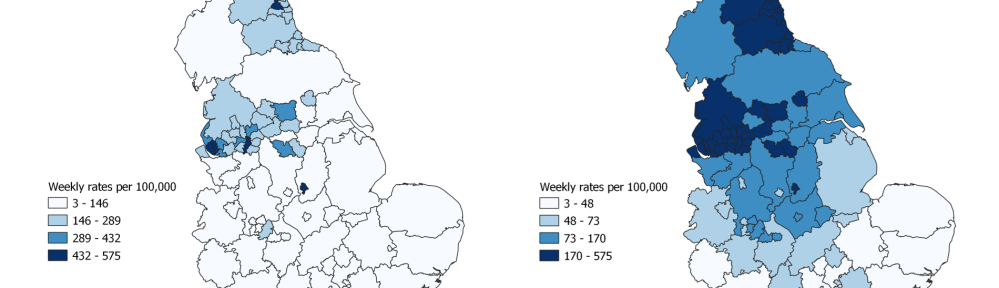
Consider the example below, of coronavirus rates from Public Health England’s surveillance reports, last week and then this week. (And an apology that this post focuses only on examples from England – it’s hard work to stitch together data from all four nations).

The map on the right shows twice as many cases, but looks less alarming because PHE have taken the decision to change the binning. On the left everything over 45 cases per 100,000 is red, on the right only areas over 335 are red.
This is not a criticism of PHE, they changed their weekly map for good reason, if they’d kept the binning unchanged the map would soon be all red, which tells us nothing about the distribution of cases. (It would, however, have been good practice to include a note alongside the new map drawing attention to the change.)
But consider what story the two maps tell, and the policy choices they suggest. Looking at the left, you might be struck by the fact that the issues being faced by much of northern England are now starting to spread to other places. You might decide that urgent pre-emptive action is needed to stop places like London following the same course.
But looking at the map on the right, you might conclude that the serious issue is concentrated in a few major urban areas in the North, and that the urgent priority should be stricter controls focused on those specific areas.
As it happens, both are true. Neither map is lying, but it can be very hard to get the binning right to tell both stories at the same time.
And here’s another quirk of data bins to watch out for – look at the keys on the maps below. They show exactly the same data but the one of the left has the bins arranged into four equal intervals, 143 cases wide. The one on the right has the bins arranged to cover an equal number of councils, 38 in each.
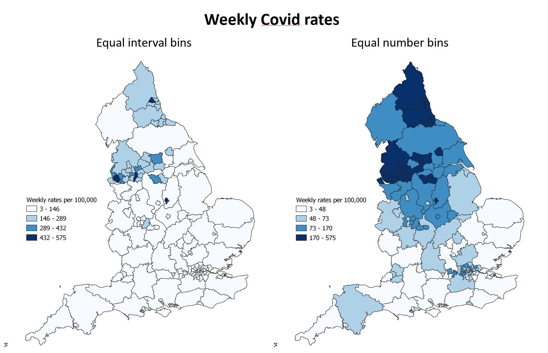
Again, neither is right or wrong, both tell you something important and true, but they’re telling you something different. It’s a good illustration of why you shouldn’t assume that your first impression of a data map is necessarily the whole story.
2. Colour gradients
Linked to the binning problem, is the colour scheme, which can greatly influence our understanding of a map. A simple gradient of one colour is often clearest (and also best for for colour blindness), but the choice of colour makes a difference to our emotional reaction – from soothing cool blues to alarming reds.
And colour can also be used to imply a particular threshold, or draw our attention to one area. The maps below show exactly the same data, but by picking out some bins in a different colour the map on the right gives a strong message about where is OK and where is not. This approach has been used regularly by some news channels.

Yet again, to stress, this is not necessarily wrong. There is a particularly acute problem in the red areas that needs urgent attention. But we need to be aware with maps like these that a choice has been made about what threshold to highlight, and decide if it’s appropriate.
3. Scale and detail
Generally with maps, more detail is better, but only if that doesn’t obscure the bigger picture.
In the maps above you may notice that Devon stands out as much worse than the rest of the south west. Are new county-wide rules needed to curb the spread? Should you call and check in on your elderly aunt in Ilfracombe?
We need to be careful because a more detailed look can completely change our understanding of what’s going on, and what the best policy response should be. Using the government’s detailed interactive map, below, we find that more than 80% of Devon’s cases are in one small part of Exeter. Probably due to the predictably disastrous national decision to pack students off to halls for in-person teaching.
But yes, you should still call your elderly aunt in Ilfracombe anyway!

But too much detail can mean missing the wood for the trees. Using the same map for a wider view, the worrying dark blue clusters in places like Leeds, Bradford and Manchester are almost completely obscured by grey lines. And who knows from this what’s happening in London. It is often better to design these maps without lines around the boundaries (even though that’s usually the default), as it can hide the detail.

4. Rural dominance
This brings us to a related problem – the fact that maps represent land, but often what we’re really interested in is people.
Take this view of Nottinghamshire, below, from the Government’s Covid map. The eye is easily drawn to the huge area of dark blue around Lowdham, to the northeast of the city. But given that each of these areas (called “Mid-level super output areas” or MSOAs) have roughly the same number of people in, we should be more concerned about the 12 tiny dark blue areas in Nottingham itself. They contain far more people and far more cases.

A geographic map downplays the cities (where most people are), and highlights the countryside (where most people aren’t). The alternative is a to distort the map in proportion to population rather than actual area. This is called a cartogram, and two examples are shown below.
The first (which has a couple of data gaps due to local government reorganisation) really shows what a large proportion of the population is now in areas where Covid rates are hitting hard again.
The second is the government’s hexmap of Covid, with the added bonus of animation.


For both of these, what they gain in fairly showing population, they lose in being hard to interpret spatially, as it’s not always clear what’s really where. They are often best used alongside traditional maps, rather than replacing them.
5. MAUP
OK, I’ve saved the best till last. This is perhaps the most subtle, and the most dangerous confusion choropleths can cause, and it goes by the off-putting title of the Modifiable Areal Unit Problem, or MAUP.
Remember how different things looked in Devon when we zoomed in to see Exeter? Well that’s just the thin end of the big MAUP wedge. What the data looks like depends on where you draw your boundaries, and there’s no single neutral or correct answer to that.
American politics can famously turn an area of four marginal districts into three safe seats and a loss, by “redistricting”, or twisting the boundaries so the same voters in the same city are divided up to produce a different result. This “gerrymandering” is named after a 19th century governor of Massachusetts, Elbridge Gerry, who twisted one district of Boston into the shape of a salamander.
You’re unlikely to find deliberately gerrymandered Covid maps, but you will find that accidents of boundaries distort what you see in ways that you could easily miss. For example in the maps at the start of this post, while we can’t really see Exeter’s cluster, Nottingham and Leicester really stand out. This is not just because they have a lot of cases (which they do), but also a chance consequence of local administrative geography. Nottingham and Leicester happen to be unitary authorities, separate from their respective counties, so their data is not diluted across their county in the way Exeter’s is. So whether you are looking at a map showing counties, districts, wards, or MSOAs, you may end up with a different idea of where the hotspots are.
This is nicely demonstrated in the hypothetical example below from GIS Population Science. Same data with different boundaries gives very different choropleth colouring.

So those are some of the things to watch out for when reading choropleth maps. But none of that should make you distrust them – data is essential for understanding the pandemic, and maps are a great way to see that. But understanding how choropleths work helps us get even more from them.
In the meantime, wear a mask, keep your distance, follow the guidance. Stay safe, look after yourself, and those around you. Before too long we’ll be looking at maps of falling rates.
UPDATE (14/10/20) – Not long after publishing this post, the Government changed their interactive map, with a new link here. It’s a significant improvement, and deals well with the “scale and detail” problem I outlined above by adapting to the scale of zoom – shifting from counties to districts to MSOAs as you focus in. So zooming into Exeter gives you this below, which solves the problem neatly. It also does away with the problem of boundaries obscuring the detail of cities when viewed nationally.
As a bonus, they’re now colouring it by rate not number (essential when the sizes of population in different areas varies so much), which also matches the triggers being discussed for tiers of lockdowns.
Overall, I like the way this map presents the data much more. However I don’t like what data is saying to us, at all…


